What’s your style?
Types of buttons
Want fries with that?
You can have buttons with text, buttons with images and buttons with text and images.
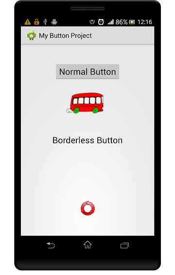
From the top: a normal button, button with an image background, a borderless button and an image button
Use the Button class for buttons with text and images.
You can also use the Button class for buttons using an image as the background.
Use the ImageButton class for image buttons.
Have a look at the screenshot above. The top three buttons are variations of the Button class.
The bottom button uses the ImageButton class.
Has it got the look?
Styling buttons
Your buttons will look different on different devices.
Different devices have different default themes. These determine what the button will look like.
Make your buttons look the same on all devices.
Force all devices to use your theme so that the buttons look the same on all devices.
Simply choose your theme and set it in the AndroidManifest.xml file:

We’ve chosen to use the Holo.Light theme and set it in the manifest
For uniqueness, you can create your own style and apply that to the button.
Here’s how we set the State List button to use our State List custom background:

We created a custom State List in an xml file and saved it as button_custom.xml in the res>drawable folder

Here’s how we set the button to use our custom background
What’s a State List?
A State List is a list of colors. A different color is chosen from the list, depending on the state of the button.
Our list consists of two colors, blue and red. There is an order in the list and the chosen color depends on which color best fits the current state.
While the button is not pressed, it is red. As soon as the user presses the button, state_pressed becomes true and the button turns blue.
You can also use different colors and images as a button’s background.
Here’s how we included the bus image in code:

Use setBackgroundResource() to use an image for the button’s background
And here’s how we use the background attribute in the xml layout file:

This uses the system transparent color to set the background of the image button to transparent. Notice that it also removes the border
Buttons without borders
You can remove the button’s border with this line of code:

Including this code in your button’s xml code makes the border disappear. It also removes the background but the button still changes color when it is pressed
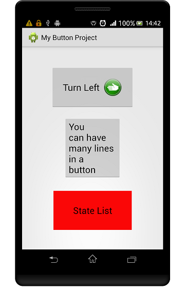
From the top: a button which includes text and an image, a button with multiple lines of text and a State List button
Have it both ways: A text and image button
Define the button in xml. Use the drawableRight attribute to position the image to the right of the text (see the documentation for other options).
Use the drawablePadding attribute to put a space between the text and the image.
Put your book in a button: The multi-line button
Use the linefeed characters (\n) to make text appear on different lines, like this:

Here’s the string with the linefeed characters
Use the gravity attribute to align the text on the left:

State List button
The button changes color to blue when clicked. See here for more details on a State List.
Clickety-click: Handling the button clicks
There are a couple of ways that you can handle the button presses.
In your layout file
Add the android:onClick attribute to the Button element in your xml code:
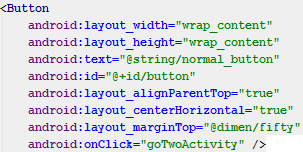
Then include the method in your activity:

The goTwoActivity() method is executed when the button is pressed
In your activities
Use the OnClickListener for individual buttons
Assign the listener to each button like this:
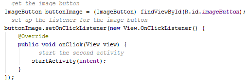
The code inside the onClick() method is executed each time the button is pressed
Implementing the OnClickListener in the activity
Got a lot of buttons?
Maybe it’s easier doing it this way?
Let the activity implement the OnClickListener like this:

Then include the onClick() method to handle all the button clicks:
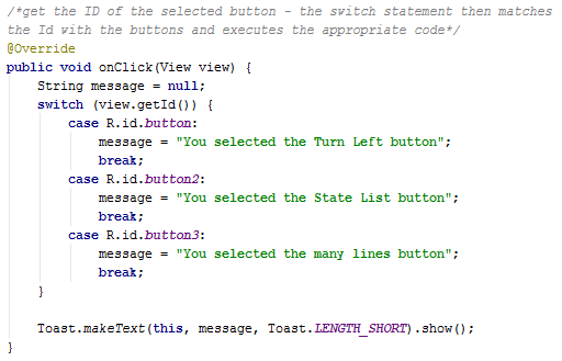
The switch statement matches the selected button and displays a Toast message
I hope you found this tutorial useful.
Please consider subscribing to our notification email. We’ll send you one email on Friday with links to our latest tutorials. That way you won’t miss out. If we didn’t publish any then we won’t send any email. No spam.
This tutorial was created using . You can download the project files here 
Are you using Eclipse or another IDE? Here's how you can use this project's Android Studio files.


