Our tutorial app
Our tutorial app displays a number of images in a Spinner.
At first, the currently selected image is displayed in the Spinner. Touching the image displays a dialog window with all the images in a scrolling list.
You may be interested in reading, Making a list: Coding list dialogs for more on Dialogs.
Selecting an image displays a Toast message showing the index of the selected image.
Note that the first image in the list is selected by default when the spinner is first displayed. You can set this to any of the images if you wish.

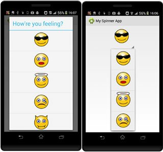
Closed, the Spinner displays a single image. Selecting the image displays all the images in a scrolling list inside a Dialog window
The Spinner items: Our Images
Usually you would display text in a Spinner. We’re going to show images.
We have a number of images saved in the res/drawable-mdpi folder.
We list their Resource Id’s in the Integer array, emoticons.
Displaying the items: Our Spinner
A Spinner displays a list of selectable items. Ours displays a list of images which the user can choose from.
We define the Spinner in our activity_main.xml layout file:

We add the Spinner to the main activity’s layout file
Note the following:
- wrap_content – we set the width and height of the Spinner to the size of the images it will display. Note that this is the size of the Spinner as displayed unopened
- layout_gravity – centres the Spinner horizontally on the screen
- prompt – the heading to display in the drop down list. It must reference another resource. We reference a String resource, “How’re you feeling?”. Note that the Theme used determines whether or not the prompt heading will display. See the discussion on Style below
- spinnerMode – determines how the image items should appear. They can either appear in a Dialog window or in a drop-down list. Note that spinnerMode is only used in API 11 and higher. See below

This is what it looks like on a Jelly Bean device when the spinnerMode is set to dialog on the left and to dropDown on the right. On a Froyo device, spinnerMode has no affect and the items display in a Dialog window similar to the one above on the left
The Style
The Theme determines the look of the Spinner.
We’ll get the result as seen in the image below (top) on a Froyo device if we use the Theme.AppCompat.Light theme.
It will appear as seen in the image below (bottom) on a Jelly Bean device.

We get different results on different devices when we use the Theme.AppCompat.Light theme
To ensure that the Spinner appears the same on all devices, we customise the theme by adding the spinnerStyle item as below (see the res/values/styles.xml file):

Customising the theme to include the spinnerStyle attribute ensures that the Spinner looks the same on all devices

Using the customised theme, this is what the Spinner will look like on all devices
Getting the items: The Adapter
Our adapter needs to get an image, put it into a view and then pass that view on to the Spinner to display as a row in its list.
We create a custom adapter to do this.
We first get a reference to the Spinner defined in the activity_main.xml layout file. Then we set our custom adapter to be used by the Spinner to get and display the images:

We get a reference to our Spinner and then set the custom adapter to be used to display the images
Customising the adapter: The Custom Adapter
We create a custom adapter by extending the BaseAdapter class:

Our custom adapter extends the BaseAdapter class
Holding the view: Using a ViewHolder

Our ViewHolder object stores an image view
Each image in the Spinner is displayed in an image view. Calling findViewById() to get the image view each time we want to display an image can slow things down.
It’s quicker using a view holder to store the image view. Then we simply access the view directly from the view holder without having to call findViewById() to find it.
Getting the view
We use the getView() method to get a view to display each image:

We get a view if it exists else we create a new one and then display the image
Note the following:
- itemView – we use this view to display an image
- emoticonViewHolder – our view holder object
- convertView – a previous view which may exist. We use it if it does
- if the view does not exist then we create a new one by inflating the spinner_row.xml layout file. See The Spinner Row Layout below
- we create a new ViewHolder object and store a reference to the image view identified by spinnerImage
- setTag – we mark the view so that we can access it later
- if the view already exists then we simply get hold of it using the tag as an identifier
- setImageDrawable – we set the image to display in the image view contained by the view holder
- getResources – gets an instance of our application’s resources
- getDrawable – gets the drawable identified by the resource id in the emoticons array. We use position as the array index
- returns the view with the image to display as a row in the Spinner
Making a choice: The Listener
Our activity implements the OnItemSelectedListener interface. We’ll use it to handle when the user selects an image.

The onItemSelected() method is called when an image is selected
The onItemSelected() method is called when an image is selected. We use it to display a Toast message indicating which item was selected.
All in a row: The Spinner Row Layout
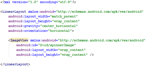
The res/layout/spinner_row.xml layout file is a LinearLayout containing an image view which displays one of our images.

This layout is displayed as a row in the Spinner
I hope that you have found this tutorial helpful.
This project was created using .
You can download the project files here 
Are you using Eclipse or another IDE? Here's how you can use this project's Android Studio files.


