Android groups the different screen densities into a number of generalized buckets ranging from low density to extra-extra-high density. These are the drawable folders for those generalised buckets:
- drawable-ldpi
- drawable-mdpi
- drawable-hdpi
- drawable-xhdpi
- drawable-xxhdpi
Place your images in the correct folders and the Android system will make sure that the correct image is used at runtime.
You should always provide alternative images for these different density groups – if your app targets those groups.
Creating different size images
Start with the medium density image, it’s your baseline
The medium density group or mdpi is considered the baseline. Choose an image that is your baseline image. Then scale it up and down to get an image suitable for the other density groups.
Just so you know, baseline is based on the screen density of the first Android-powered device, the T-Mobile G1.
Creating Alternative Bitmaps
Preferably start with a Vector graphics image as this can be scaled without any loss of quality.

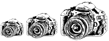
Here are the ldpi (75px), mdpi (100px) and hdpi (150px) images

Here are the xhdpi (200px) and xxhdpi (300px) images
Calculating the alternative image sizes
Use the mdpi image as the baseline, here it is 100 pixels wide.
|
Screen Density Bucket |
Screen density |
Multiply by |
Example Image size (width) |
Folder |
|
ldpi |
~120dpi |
0.75 |
75px |
drawable-ldpi/camera.png |
|
mdpi |
~160dpi |
1.0 |
100px |
drawable-mdpi/camera.png |
|
hdpi |
~240dpi |
1.5 |
150px |
drawable-hdpi/camera.png |
|
xhdpi |
~320dpi |
2.0 |
200px |
drawable-xhdpi/camera.png |
|
xxhdpi |
~480dpi |
3.0 |
300px |
drawable-xxhdpi/camera.png |
|
nodpi |
Density-independent |
Not applicable |
Any size |
drawable-nodpi/something.png |
|
baseline |
baseline |
1.0 |
100px |
drawable/camera.png |
Table 1
It’s not the size that counts but the density
Our image sizes are given in pixels. The Android system will select which folder to choose an image from, depending on the device’s screen density.
Use the figure in the Multiply by column and multiply the baseline image dimension by it to calculate the different image sizes. Then scale your baseline Vector image to the various sizes. Android does not recognise Vector graphics, so make sure that you save the resized images as PNG images (or Jpeg, PNG is preferred).
You can now place them in the relevant drawable folders. Note that the images must have the same file name.
An example
Here are the specs for a Sony phone and a Samsung tablet. Although the phone’s physical screen size is smaller than the tablet’s, the phone has a higher screen density.
|
Screen width in pixels |
Screen height in pixels |
Diagonal length in inches |
Screen density in pixels per inch |
|
|
Sony Xperia V |
720 |
1280 |
4.3 |
342 |
|
Samsung GT-3110 7 inch Tab |
600 |
1024 |
7 |
170 |
Table 2
Use this formula to calculate the screen density
Diagonal resolution = √screen width2 + screen height2
Screen density in pixels per inch = diagonal resolution/diagonal length in inches
Looking at Table 1 we see that we need an mdpi image for the tablet and a xhdpi image for the phone.
My baseline image is 200 x 200 pixels. I doubled the size of this for the xhdpi image. I placed the baseline image in the drawable-mdpi folder and the other in the drawable-xhdpi folder.
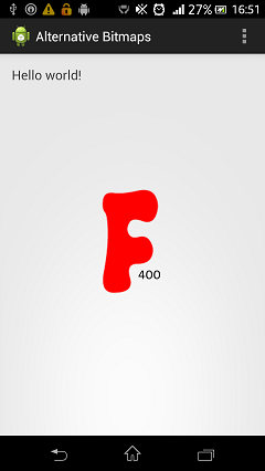
The mdpi image is 200 x 200 and is identified by the 200 label. The xhdpi image is 400 x 400 and is identified by the 400 label.
Below are screenshots of the tablet and phone where you can clearly see which image was used. Although it appears that the letter is bigger on the phone, in reality, it is the same size on both devices.


Remember that devices with the same screen size may not have the same screen density.
The Android system will select the correct image at runtime based on the screen density of the device. If an appropriate image can’t be found, then the default image will be used and scaled up or down.
Default drawables should be placed in a drawable folder without a qualifier, i.e. just drawable. It assumes that these are images designed as baseline images.
The Android system doesn’t always use the default image if no matching alternative is found. For example, if there is no ldpi image, the system will take an hdpi image and scale it down by 0.5 rather than scaling down the default image by 0.75.
Images in the drawable-nodpi folder can be used on any screen density – they will be used as is and not scaled. Images in this folder must have a unique file name and must not appear in any of the other folders.
Remember that you will also have to provide alternative nine-patch drawables if you use them.
What are nine-patch drawables?
It’s an image in nine sections which can be stretched without distorting or pixelating. It’s usually used as a background for any object that will be resized when displayed on different density screens. A good example is the background of a button. You can see more on nine-patch images in the official documentation.
Free image editing software
Here are links to two great, free image editing software packages. You can use Inkscape when working with Vector graphics.
GIMP
“GIMP is the GNU Image Manipulation Program. It is a freely distributed piece of software for such tasks as photo retouching, image composition and image authoring. It works on many operating systems, in many languages...”
Inkscape
“Inkscape is professional quality vector graphics software which runs on Windows, Mac OS X and Linux. It is used by design professionals and hobbyists worldwide, for creating a wide variety of graphics such as illustrations, icons, logos, diagrams, maps and web graphics. Inkscape uses the W3Copen standard SVG (Scalable Vector Graphics) as its native format, and is free and open-source software.”
Need free images with no restrictions for your app? Check out our FREE app, that lets you download clip art images from openclipart.org.


 This is the 2nd part of a two part series of articles on