Our tutorial app
We’ll show you how to replace the Action Bar with the Toolbar. We also show you how to display a standalone Toolbar.
We’ve compiled our app using SDK 21. You should be able to build it with a minimum SDK of 7; we’ve set ours to 10.
We’re using the updated AppCompat support library (AppCompat v21) which gives us access to the Toolbar widget so that we can use it on pre-Lollipop devices (from API Level 7 and up).
Here’s a screenshot of our custom Toolbar in place of the ActionBar:
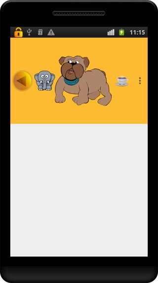
Our customized Toolbar replaces the activity’s ActionBar
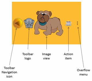
You have more control over the look and functionality of the Toolbar
You can do it your way but this is how we did it
Extend the ActionBarActivity class
Let your activity extend the ActionBarActivity class:
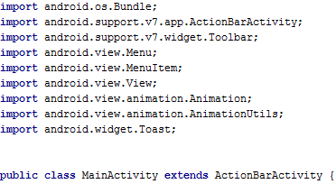
Let your Activity extend the ActionBarActivity class
Use the AppCompat theme
You must use the Theme.AppCompat as your base theme:

Use the Theme.AppCompat theme or any of its variants
We’ve used the light variation with no action bar as we’re replacing the ActionBar with the Toolbar.
It’s your choice: Choose where you want to display the Toolbar
Take over the bar: Replacing the ActionBar with a Toolbar
Put it out of action: Disable the ActionBar
You need to disable the ActionBar if you want to replace it with a Toolbar. We’ve done this in our styles.xml file where we set our theme to use the NoActionBar variation of the AppCompat Light theme.
Get your toolbox: Create your Toolbar widget in an XML layout file
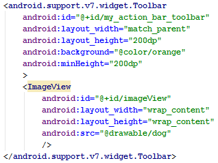
Define the Toolbar in a layout file
A quick explanation
Use the support library’s Toolbar widget element and give it an ID so that we can access it later in code.
The width is set to match the parent’s so that it will span the width of the screen. The height is set to 200dp to accommodate the dog image which is 200dp high.
We’ve set the background colour to orange.
The minimum height is set to 200dp. This ensures that all the displayed items are vertically centred.
Finally we include an image view referencing a drawable resource for the image to display.
Get to work: Set up the Toolbar as the ActionBar in code

Get a reference to the Toolbar and then set the icon and logo
A quick explanation
We get a reference to the Toolbar and then call setSupportActionBar() to set the Toolbar as the ActionBar. Note that you should call this first if you’re going to be adding logos and navigation icons else they won’t show.
Then we call setNavigationIcon() to display our back arrow image which we’ll use to navigate back. You must include a description for the navigation icon which will be used to describe the logo to visually impaired users
We also include a logo for the Toolbar by calling setLogo(). We also include a description for it.
Use the onOptionsItemSelected() method to handle the options menu item selections.
You can also use the setNavigationOnClickListener() to listen for when the navigation icon is pressed, using its onClick() method to deal with the navigation. We’ll show you how when we discuss the standalone Toolbar later.
Call setTitle(null) in the onCreate() method if the title shows and you don't want it to.
Including a menu in the Toolbar
As this Toolbar is replacing our ActionBar, we chose to include a menu action item as well as the menu’s overflow button.
We use the onCreateOptionsMenu() method to inflate the menu resource.
Handling the Toolbar’s item selections
We use the onOptionsItemSelected() method to handle the menu item selections.
We display an appropriate Toast message if either of the menu items is selected.
Selecting the action item makes the standalone Toolbar visible. We then use an animation to fade it in.
Going solo: Displaying a standalone Toolbar
You can display a standalone Toolbar anywhere on the screen. We show ours at the bottom. Here’s a screenshot:
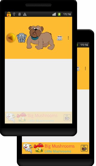
Pressing the Action item fades in a standalone Toolbar at the bottom of the screen. Pressing the Ghost navigation icon on the left sets the visibility of the Toolbar to GONE
You don’t have to disable the ActionBar for the standalone option.
Create your Toolbar widget in an XML layout file
Define the Toolbar in a layout file:
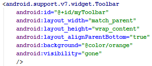
We define the standalone Toolbar in our activity_main.xml layout file
A quick explanation
Use the support library’s Toolbar widget element and give it an ID so that we can access it later in code.
The width is set to match the parent’s so that it will span the width of the screen. The height is set to wrap_content so it will only be as high as the largest object it contains.
We use the layout_alignParentBottom attribute to display the Toolbar at the bottom of the screen.
We’ve set the background colour to orange using the background attribute.
Finally we set the Toolbar’s visibility to GONE. This ensures that it’s not visible and nor does it take up any screen space.
Putting it together: Set up the standalone Toolbar in code
We first declare a Toolbar field, toolbar. Then we get a reference to the Toolbar widget and apply our custom settings:

Get a reference to the Toolbar and then set the logo, title, subtitle, navigation icon and inflate the menu
A quick explanation
We set the logo to display, passing a drawable reference as a parameter. We also include a description for the logo which will be used to describe the logo to visually impaired users.
We then set the title and subtitle as well as their text colours.
We set the navigation icon, referencing a drawable resource to display. We also include a description for the icon which will be used to describe the icon to visually impaired users.
Finally, we call inflateMenu() to inflate a menu resource file. This will display the action item in the Toolbar.
Lend me your ears: Listen for the action
We include two listeners:
- One listens for the menu item selections
- One listens for the navigation icon selections
Listening for menu item selections
We need to include the Toolbar class’s setOnMenuItemClickListener() method to listen for when the menu’s Action item is selected:

Use the setOnMenuItemClickListener() method to listen for menu item selections
A quick explanation
We attach the listener to our standalone Toolbar. It listens for when a menu item is selected, triggering its onClick() method. Here we include a Toast message to display when the Action item is selected.
Listening for when the navigation item is selected
We include the Toolbar class’s setNavigationOnClickListener() method to listen for when the navigation icon is selected:

Use the setNavigationOnClickListener () method to listen for when the navigation icon is selected
A quick explanation
We attach the listener to our standalone Toolbar. It listens for when the navigation icon is selected, triggering its onClick() method. Here we include a Toast message which is displayed when the navigation icon is selected.
We also set the Toolbar’s visibility to GONE, making it invisible, and ensuring that it doesn’t take up any screen space.
Check out Chris Bane’s blog post on using AppCompat v21 and the Toolbar
You may also be interested in our tutorials:
- Using menus in your apps
- Using Android’s Action Bar
I hope that you have found this tutorial helpful.
This project was created using .
You can download the project files here 
Are you using Eclipse or another IDE? Here's how you can use this project's Android Studio files.


