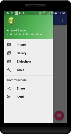
Note however that according to material design best practices:
- Left drawers should have options for navigating around the app
- Right drawers should have actions that can be performed on the current content
Don’t go it alone: Use the Support library
The design support library lets you include material design features in your navigation drawers.
We’re also using the AppCompat support Library so our app will work on Jelly Bean (Api 16) and above.
Check your build.gradle (Module: app) file.
We’re compiling our app using Sdk version 23 with a minimum Sdk version of 16 so our dependencies include these two Support libraries:

Include these two support libraries in your gradle dependencies
Our one and only Activity
We only have one activity in our tutorial app, the MainActivity.
Our activity extends AppCompatActivity which is the base class for activities using the support library Action Bar features.
Here’s our activity’s onCreate() method

Use the onCreate() method to inflate your layout and get the Toolbar
What’s happening here?
- setContentView() – we tell the activity to use the activity_main layout
- toolbar – we get a reference to our Toolbar which we’ll use instead of the ActionBar
- setSupportActionBar() – we replace the ActionBar with our Toolbar
Out with the old, in with the new: Replace the ActionBar with a Toolbar
Do it in Style
We need to tell the Android system that we’re replacing the ActionBar with our Toolbar. We do this in the styles resource file by defining a custom style called AppTheme.NoActionBar:

Define your NoActionBar style in the styles resource file
Is it in the manifest?
We then notify the Android system in the AndroidManifest.xml file that we want the MainActivity activity to use this style:

Specify in the manifest file that the MainActivity should use the NoActionBar style
Have you seen this tutorial? Using Toolbars in your apps
The master plan: The MainActivity layout
So here’s the activity_main layout code:
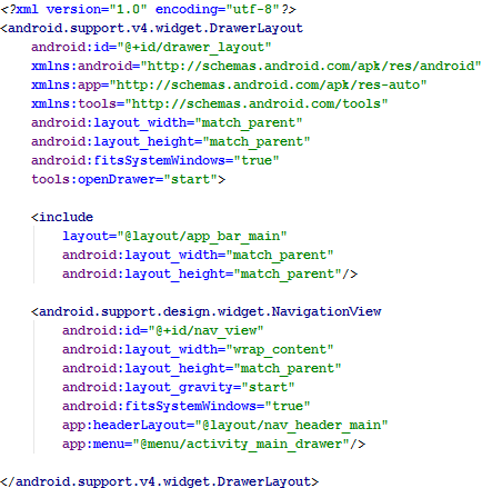
The MainActivity layout has a DrawerLayout as its root layout. Your main content must be the first child view
What’s happening here?
- DrawerLayout – we use the DrawerLayout widget as the top level container
- include – you must place the main content of the activity as the first child of the DrawerLayout. We use the
tag to include another layout, app_bar_main that contains our main content. You may want to check out this tutorial, Improve layout performance: use include and merge - Navigation View – contains the navigation menu for our drawer – it’s populated from a menu resource file
- layout_gravity – this determines whether the drawer slides out from the left (start) or right (end) of the screen
- headerLayout – this layout defines the look of the drawer header. See the image below

The drawer header
- menu – we inflate the menu resource file, activity_main_drawer to get our drawer navigation items. More on this later
Heads up: The Drawer’s Header layout
You can choose what you want to display in the header by defining its look in a layout resource file.
We’ve defined our header in the nav_header_main xml layout file.
Here’s the code:
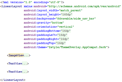
Define your drawer header in a layout resource file
What’s happening here?
A root, LinearLayout contains an image view plus two text views.
- background – we use a drawable defined in xml for the green background
- theme – we use the system theme, ThemeOverLay.AppCompat.Dark which essentially displays our text in white or a light color (on our dark background)
Jumping Jack: Back to the activity_main layout
Here’s looking at the NavigationView, again!
The Navigation Drawer menu
- menu – we define our navigation drawer menu items in a menu resource file, activity_main_drawer. The resource file is inflated and displays the menu in the drawer. Here’s the code:
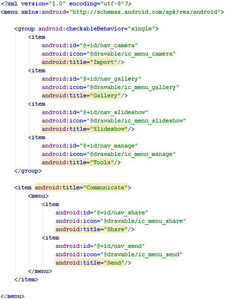
Define the Navigation Drawer’s menu items in a menu resource file
What’s happening here?
- group – a group of menu items (a collection of menu items, usually having something in common). The group contains one or more
- elements
- checkableBehavior - the type of checkable behaviour for the group. Valid values:
- none
- all
- single – we use this option so the user can only select one item
- Communicate – a heading for the sub-menu containing the Share and Send items
Time to jump again: Revisiting the activity_main layout - So what’s included?
We’ve included the app_bar_main layout
Your activity’s main content must be the first child view in the DrawerLayout container. We’ve defined our content in a layout resource file and included that layout as the child view.
Let’s look at the included app_bar_main layout in more detail.
Here’s the code:
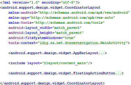
We’ve defined our main content in this separate layout file which we include in the DrawerLayout container. This layout also includes another layout
What’s happening here?
- CoordinatorLayout – a more powerful FrameLayout that allows for child views to interact with each other
- AppBarLayout – basically a vertical LinearLayout which when used within a CoordinatorLayout implements many of the material design app bar features, such as scrolling
- include – our actual main content is defined in a separate layout, content_main, which we include here
- FloatingActionButton – we include a Floating Action Button
Never ending story: Another included layout
Finally we get to our main content: The content_main layout
Okay, so finally. This is our main content, really.
And here’s the code for the included content_main layout:
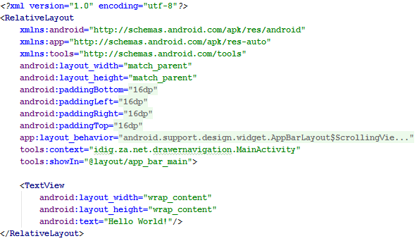
The layout where we define our main content, a simple TextView
What’s happening here?
- RelativeLayout – the root container
- TextView – our main content
Back in time: Back to the rest of the onCreate() method
Here’s the second part of the activity’s onCreate method.
This is where we get a reference to our drawer, create an ActionBarDrawerToggle to sync the drawer actions to the hamburger icon (the drawer affordance or indicator) and finally we add a listener to the drawer.
The Drawer
Here’s the code for the drawer:
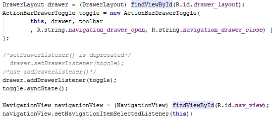
Our code for listening to the drawer events
What’s happening here?
- drawer – we get a reference to our drawer
- toggle – we create an ActionBarDrawerToggle so that we can sync the behaviour of the drawer to the drawer indicator (the hamburger icon). You can use a different icon and also animate it as the drawer opens and closes. You may want to check out these methods:
- onDrawerOpened()
- onDrawerClosed()
- onDrawerSlide()
- onDrawerStateChanged()
- addDrawerListener() – listens for when the drawer opens, closes, etc. We pass the toggle as a parameter. It will be notified when the drawer opens, closes, etc. This listener does not handle the drawer menu options selections. See setNavigationItemSelectedListener() below for that
- syncState() – this synchronises the state of the drawer (open, closed, etc.) with the drawer indicator (the hamburger icon)
- navigationView – we get a reference to our NavigationView so that we can handle the menu option selections
- setNavigationItemSelectedListener() – we set a listener which will be notified when any of the drawer menu items are selected. Selections will be handled by the onNavigationItemSelected() method. See below
Let’s go Mr. Navigator: selecting navigation items in the drawer
The onNavigationItemSelected() method
Here’s how we handle navigation item selections:
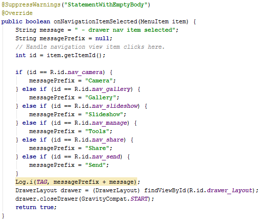
onNavigationItemSelected() is triggered when a drawer menu item is selected
What’s happening here?
This method is triggered whenever a drawer menu item is selected.
We’ve included a number of log messages for demonstration purposes. These will be displayed in the LogCat when an item is selected.
- item – the selected drawer menu item
- getItemId() – we get the id for the selected item
- if/else – we use an if else statement to filter the id’s. The appropriate code is executed when a match is made
- drawer – we get a reference to our drawer
- closeDrawer() – closes the drawer
Ending it all
Pressing the onBackPressed() button
Pressing the Back button finishes the activity. We use it to make sure that the drawer is closed when the activity finishes.
Here’s the code for the onBackPressed():

Calling onBackPressed() finishes the activity. Check if the drawer is open, close it if it is
Code available for download 
If you found this tutorial helpful, please consider making a . Thanks!
Resources
This tutorial is based on the activity generated by Android Studio when you choose to create a new Navigation Drawer Activity.
Material Design patterns for the Navigation Drawer
The official training guide for creating Navigation Drawers
A tutorial on Using navigation drawers in your apps
Check out SlideNerd’s video tutorial on youtube,


